Data Visualisation
First week but it's been quite full-on, possibly because I put just a little bit too much effort for the allotted time, I should probably be more realistic, but I've always been one to chase a vision with out regard to what it will take to produce. I might need to learn to be more pragmatic.
So building upon the lessons of Network Science/Social Networking, on Wednesday we reflected on the various presentations of Tuesday's data using Gephi, determining whose works were the most successful at conveying the information and why. The use of colour, size and position along with general placement of text for readability varied between different people's presentations so we could all see clearly what worked and what didn't and learn from it.
We were then introduced to some other examples of visual display of data, and a pioneer in this field, Edward Tufte, along with a short video of his critique of the iphone interface. This caught my interest in particular, as interface design is something I find mildly interesting, often commenting on various elements of Windows and OSX interfaces, and gadgets and mobile phones. I'm pretty sure somewhere in my portfolio that got me into the course to start with I commented on the iphone interface. It was a type of interface I'd been sort of waiting for, finding normal mobile phones incredibly clunky to use. To me the bad design really shows it self when you are in a rush, and cell phones are one piece of equipment you are likely to use when in a rush or a panic. Getting lost in their screens and menus because is incredibly poor design in my opinion.
You have to watch the video in the link to know what I'm talking about in this paragraph. I tended to agree a little with the sentiments of his critique on the stock exchange application, although his version was a little ugly. I imagine that if you follow the stock exchange on a daily basis, the crammed information on Tufte's design would not be an issue. It looks daunting to those (including me) who have no idea what that information is conveying. But his theme (or lack of, it almost looked like HTML without the CSS*) certainly does not fit into Apple's.
Our task after this was to get into groups of 3 and observe and record data of some sort so that we could then visualise it. But there were restrictions to this project, mainly that the visualisation should be non-representational and must not contain words which at the time of doing, the concept was a bit lost on me. That's one reason this blog entry was not made on the day we did this project. My aim for this blog is to explain in layman's terms what I've learnt or done on this course because being able to do so to me means you understand it. I didn't quite "get" it. It seemed very abstract. To present data without actually using the subject matter, with no words, how on earth is one to know what meaning a visualisation carries? One either had to be highly creative or have more in depth understanding of data visualisation using abstract methods. Particularly considering what we chose to record as data. We sat in the foyer for an hour and counted people walking past for an hour in blocks of 10 minutes. For added interest we counted people wearing mostly black separately from those wearing colours. Interestingly by the way, colour appears to be the new black.
A time-consuming challenge was that I decided to do the presentation in Flash. I've used Flash before - several times - and produced work from it. The trouble is, I use it so infrequently that it's almost like I have to re-learn it every time. I find it's interface a bit clunky (and too macromedia-ish - the previous developers before Adobe bought them out) and while I get the basic concepts I find it really hard to actually execute the steps in those concepts. Plus not knowing keyboard shortcuts the way I know InDesign/Illustrator/Photoshop short keys really painful. Yet this didn't deter me and I produced an animation I was mildly happy with on behalf of our group. I then went straight to bed at 12:30am...
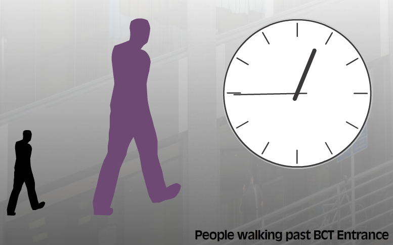
Yes I put a title in there.... Anyway it the clock turned and the walking men fluctuated in size over the duration. And yes, the walking was animated. Once I figure out how to host a swf on this blog I'll edit this post.
*HTML (HyperText Markup Language) is what web pages are essentially made of, and what web browsers read. A number of years ago in the evolution of the web, a distinct separation was made between HTML, which is the content and CSS which is the presentation and design. CSS stands for cascading style sheets. Well designed websites make a clear distinction between content and design. Advantages of such a method include easy repurposing of content for other devices such as mobile phones and TV sets, accessibility such as for blind people and also easy design change without a single change to the content. Visit https://www.csszengarden.com/ for a dramatic demonstration.